
What is Cube Cloud?
For
my first project as a UX Design Apprentice at
Bloc
, I was tasked to design a cloud storage application and brand that
would rethink the cloud storage market by targeting the problems
people face today. According to the report, the group of people over
sixty is growing more rapidly than any other demographic. As the
population ages, though, more “seniors” will be comfortable with
technology and only need compensation for actual physiological and
cognitive changes. We need to understand these changes in order to
effectively master interface design for older adults. I designed Cube
Cloud specifically, for this reason, to serve as a new kind of
workspace that helps users of all ages animate their ideas seamlessly
and share them with a robust community.
View Desktop Prototype |
View Mobile Prototype
Role: UX Design, Visual Design, Brand Identity
Deliverables: User Surveys, Competitive Analysis, User
Personas, User Stories & Flows, Wireframes, Usability Testing, High
Fidelity Mockups, Prototype
Tools: Figma, InVision, Photoshop, Illustrator, Maze,
UsabilityHub

Problem Solving
CHAPTER #1 — Problems and Solutions
For this project, I was challenged to rethink cloud storage by targeting real-world problems that the competition hadn’t yet addressed. At first, I thought that users wanted a more intuitive, easily navigable dashboard, but my research proved that they wanted much more than that. Designers should make additional compensations for older adults in applications specifically geared toward them, —things like larger fonts, more intuitive interface elements, clear wording, and helpful tips for functionality—it will only improve their user experience.

Visual Elements for Users with Impaired Senses
Vision loss is the most common disability reported in adults in the United States. Many older adults use reading glasses or opt for much larger font sizes when given the option. Text and button sizes should be kept large. Basically, anything that’s meant to be read or clicked should be scaled up.

Improving Interaction for Older Adults
Interaction is fundamental to the user experience. Visual cues are often vital to those interactions. For older adults, especially, visual cues need to be clear, easy to decipher, and easy to interact with. But it goes beyond just making sure visual cues are clear. Every part of the interaction needs to be kept easy to understand and complete.
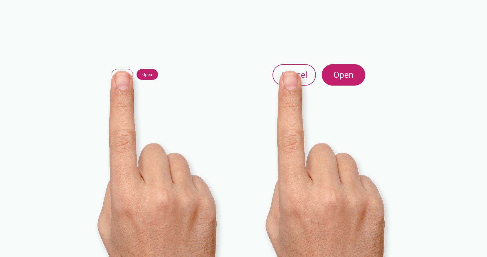
Larger buttons and other clickable targets are important for senior users.

Issues with Memory and Concentration
Older adults need a bit more time to absorb the information they’re presented with and take appropriate action. Where this becomes a real problem is when presented with complex tasks that require quick intake and processing of information in order to make decisions. Minimalist design—can help prevent cognitive overload from slower mental processing speeds in older adults. Designers should also ensure that older people’s attention isn’t being divided by multiple tasks or parts of a screen.

Motivation
While younger generations often integrate technology seamlessly into their lives, older adults use technology a bit differently. Applications that aren’t useful are generally neglected by seniors. If an older adult doesn’t find an application to be useful, they’re likely to ignore it for days, weeks, or even months. However, if they see the benefits of using an app, they’ll be motivated to use it regularly.

Discovery phase
CHAPTER #2 — The Power of Research
In order to understand how I arrived at the solutions to the problems at hand, I had to go back to the beginning — starting with user research. What were my users’ top frustrations and what did they want the most from cloud storage? I’d had a hunch, but to really know the answers to these questions, I had to turn to the responses gathered from my user research survey targeting existing cloud storage senior users creating and sharing on a frequent basis.
My initial assumptions were that users wanted an overhaul to the user experience. But what I’d found to be most informative from this survey was the desire for additional community, collaboration and saving features that would enhance user creativity.

Understanding the users
According to my
survey
, there were three types of people using cloud storage apps:
1. People who want to create and store information in
a well-organized manner
2. People who want to ideate, create content, get
feedback, and/or save content for new ideas and inspiration
3. People who want to get in sync with their friends
and family
I’d found that these survey respondents best aligned with my primary audience as they were the big curious-minded thinkers and doers. They were the designers, freelancers, illustrators, etc. between the ages of 30–55 in the creative tech industries who were constantly brainstorming and seeking perspective from industry professionals.

Competitive Analysis
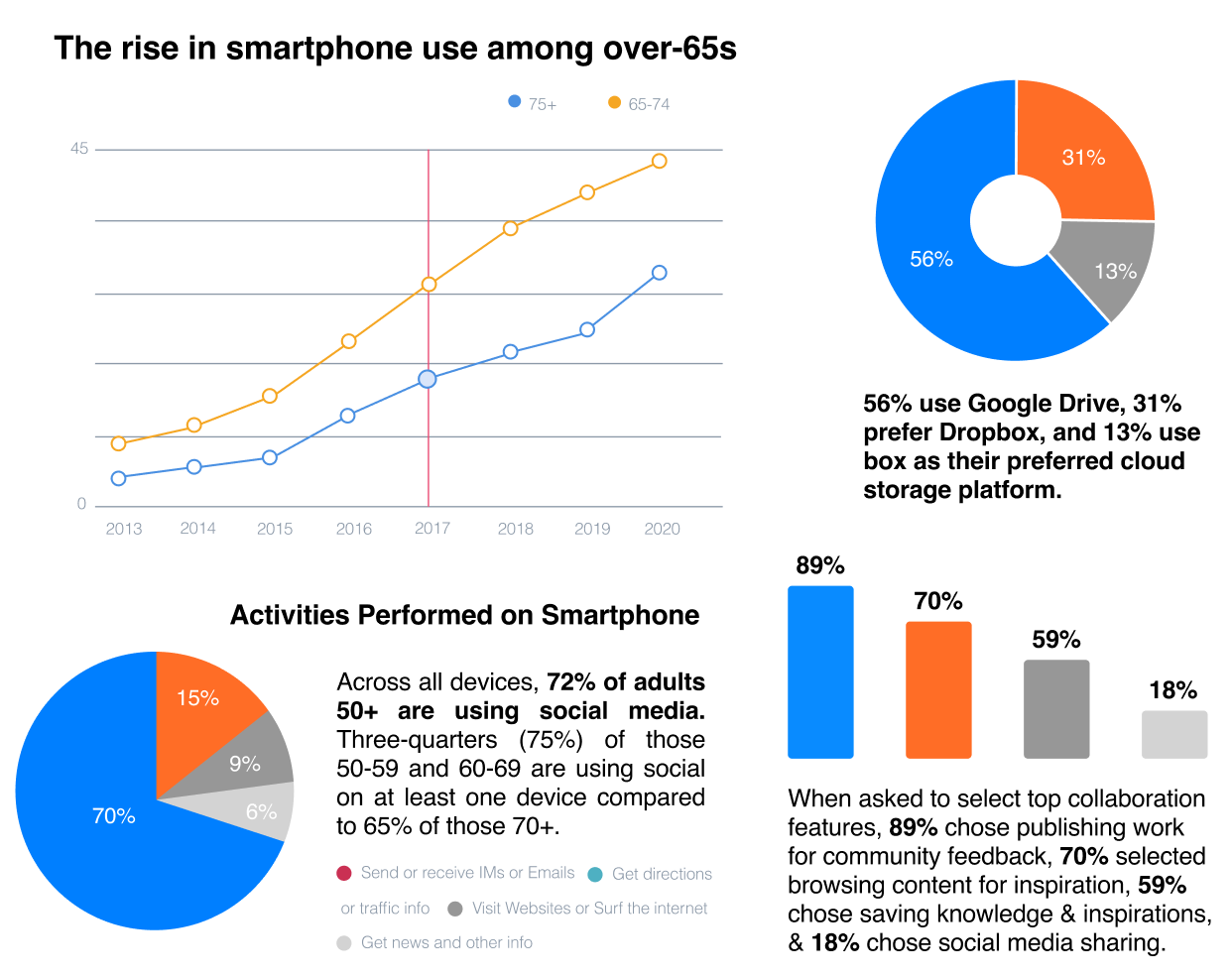
Three of the main suppliers are Google Drive, Dropbox, and Box. They give similar basic features and are very comparable. Dropbox has been available many years before Google Drive so it has a bigger piece of the overall industry, anyway Google Drive still is a nearby contender. Lastly, Box places a strong emphasis on security, especially as it pertains to collaboration. There are different approaches to file management that pose unique challenges to each vendor. Platforms and pricing, security and administrative control and collaboration.

User Personas
Personas are helpful throughout the entire product development phase: from deciding on which features to have in a prototype, to evaluating the end product. When combined with additional user experiences design methods, such as usability testing and task analyses, personas are vital to launching a useful and usable solution. Enter Gina, Tim and Jason, three vastly different personas to embody the full range of Cube Cloud’s target audience.


Mapping the MVP with user stories & flows
Keeping these personas in mind, I compiled a list of user stories focusing on the highest and medium priority tasks to reach the minimum viable product. I then converted the user stories into user flows to show how the user can accomplish the primary tasks.
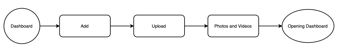
Create and upload photos user flow.
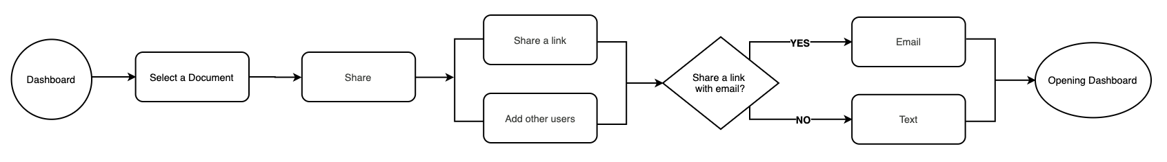
Collaborate and share a document user flow.

Branding & Identity
CHAPTER # 3 — The story behind Cube Cloud
In order to understand how I arrived at the solutions to the problems at hand, I had to go back to the beginning — starting with user research. What were my users’ top frustrations and what did they want the most from cloud storage? I’d had a hunch, but to really know the answers to these questions, I had to turn to the responses gathered from my user research survey targeting existing cloud storage senior users creating and sharing on a frequent basis.
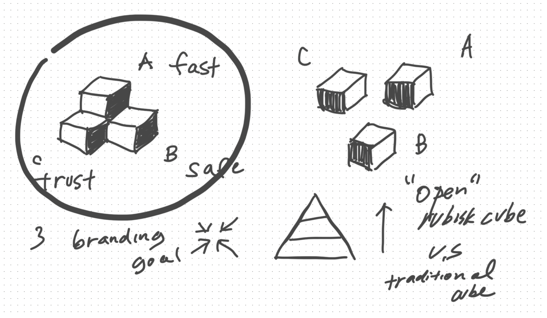
Designing the logo
After selecting the brand name, the logo underwent a plethora of sketch iterations before arriving at its final design. I began the brainstorm by using a mind-mapping exercise to curate a concept that communicated the formation of an idea when many people come together.
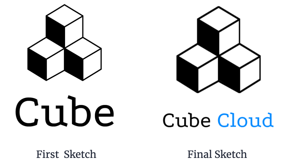
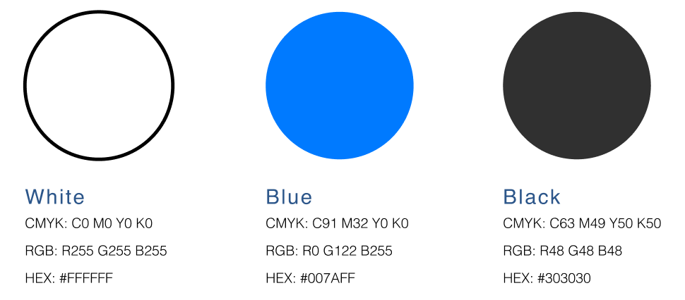
To maintain consistency with the Mathematical theme, I focused on using square and boxes planetary shapes. Why the blue logo? “Blue is associated with the sky and the ocean, which both evoke feelings of tranquility and security.” According to the “Color Associations” report, Blue got the most votes for trust, security, and reliability and finished second in high quality and high technology.
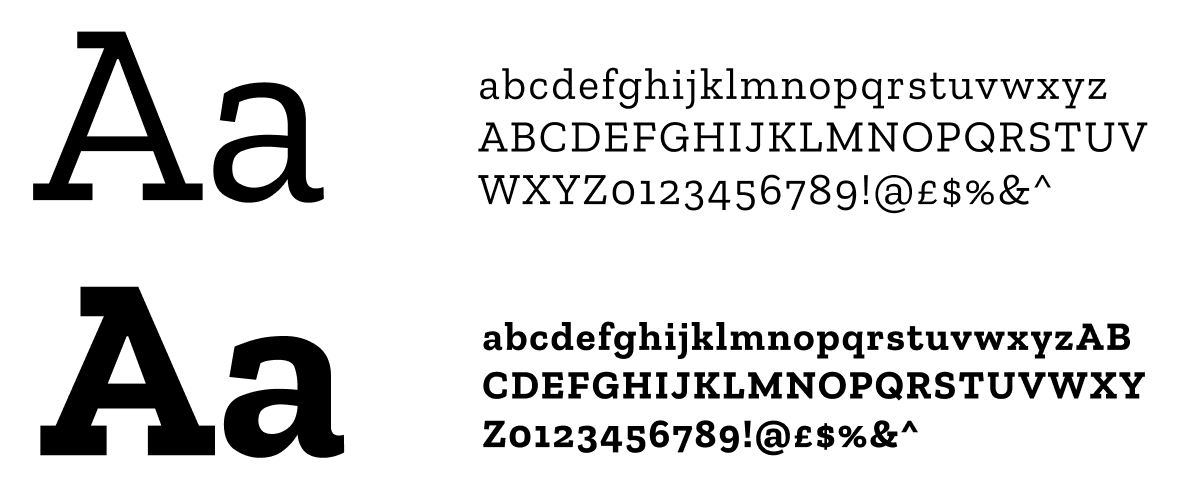
I chose to use Zila Slab as the primary typeface mainly because of its legibility, but also because its rounded appearance was reminiscent of the shapes displayed within the brand’s logo design.

Drawing Board
CHAPTER # 4 — To build the skeletal structure
The best way I’ve found to quickly, easily, and comprehensively communicate with is to share sketches and user flows throughout the whole project. Not only does this help me articulate how I plan to tackle a problem, but by thinking out loud on paper, it allows everyone—myself, designers, or even clients—to see how ideas begin, evolve, and finally crystallize into the solution we’ve all been working toward.

Referring back to the problem objectives, I knew I had to address the issue of low discoverability in cloud storage interfaces. Because of this, I chose to display top-level navigation to promote exploration and allows users to easily access the broad categories within the primary navigation before drilling down more specific pages. This top-level approach eliminated unnecessary clicking and the reliance on the search box to find files.
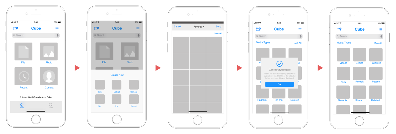
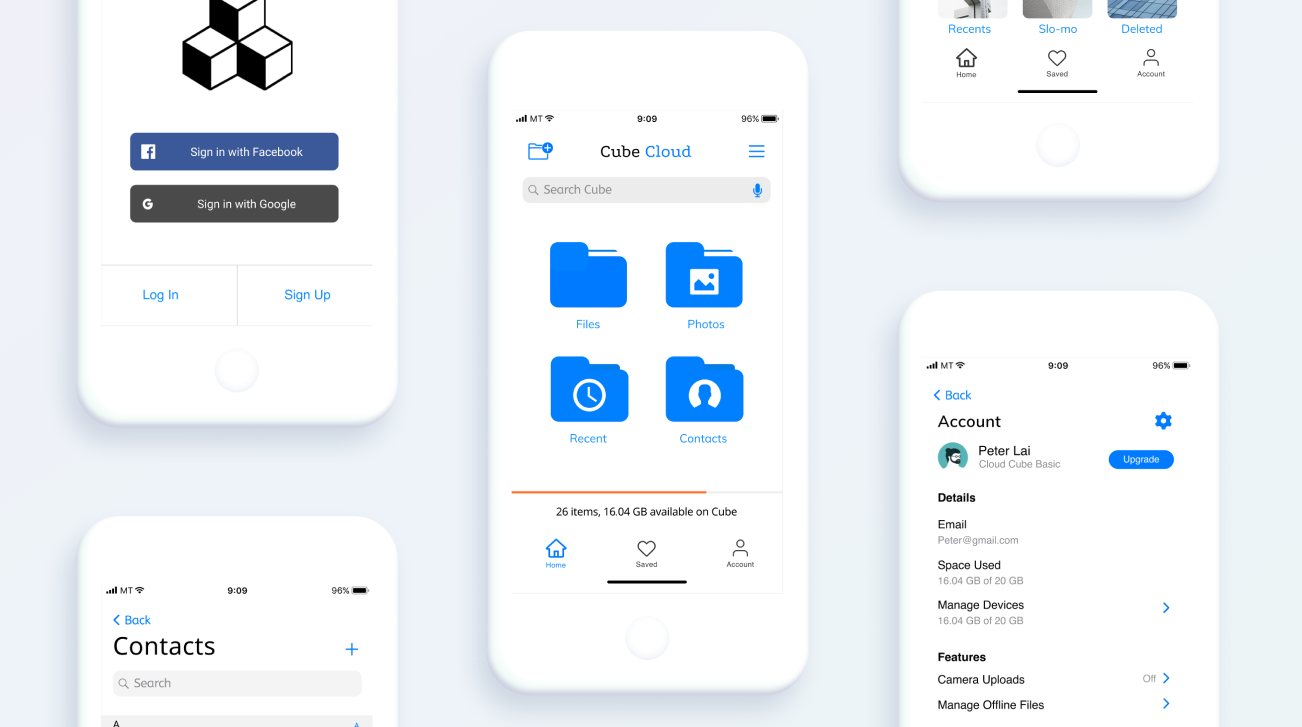
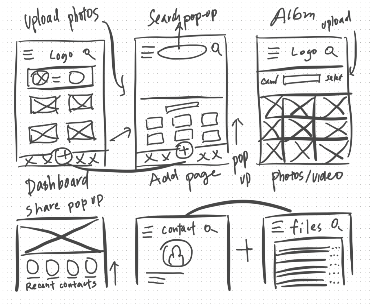
Wireframes: Upload Photos and Videos
Round 1: Testing the wireframe prototype
If I had moved onto wireframe testing at this point in the process I would have overlooked some of the most glaring issues living within my wireframes. Before moving onto high fidelity mockups, I needed to validate my design decisions through testing. To do this, I used Maze to test mission-based tasks and InVision to conduct in-person usability tests using a wireframe clickable prototype and a test script. Both served as key tools to gather feedback that informed revisions to key action items.

Wireframe iterations to the rescue
Based on the commentary from these tests, I was armed with the knowledge needed to make the following revisions:
● Adding a new label “Account” to the bottom navigation. To better access the Account and setting page.
︎● Adding Usage bar to the Dash board. To maintain high discoverability, I placed it within usage info on the display.
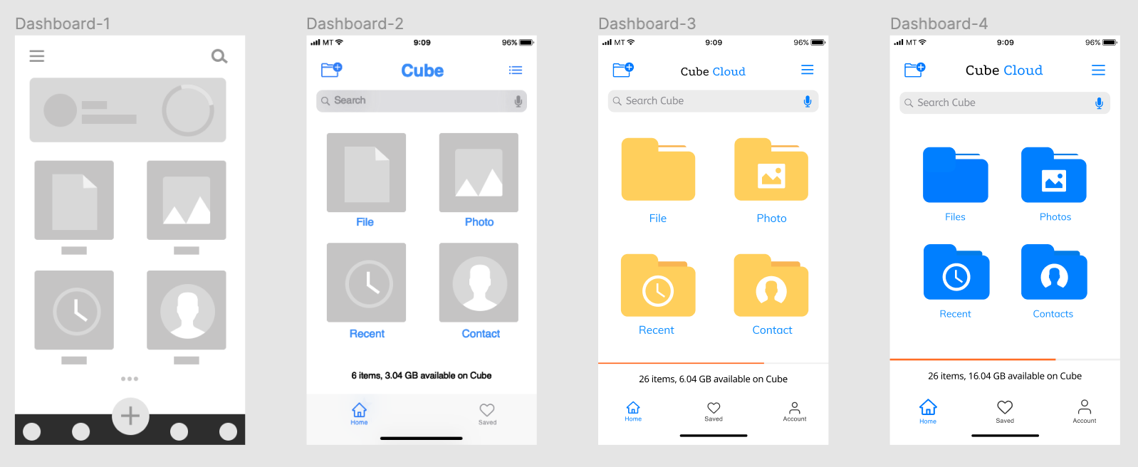
Mobile App Dashboard Progress

Layering on the skin
Keeping the branding and user flows in mind, I transformed my wireframes into high fidelity mockups by weaving in the branding to build the final prototype.
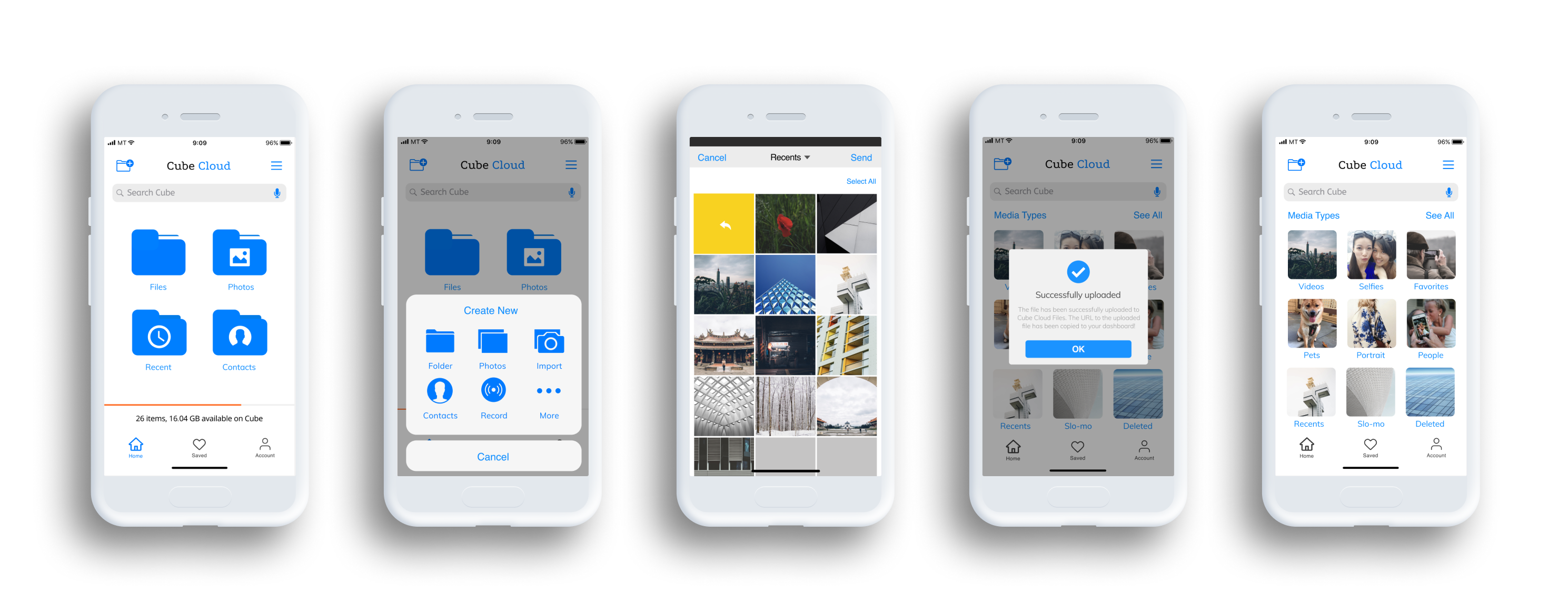
Prototype: Upload Photos and Videos

Round 2: Testing the high-fidelity prototype
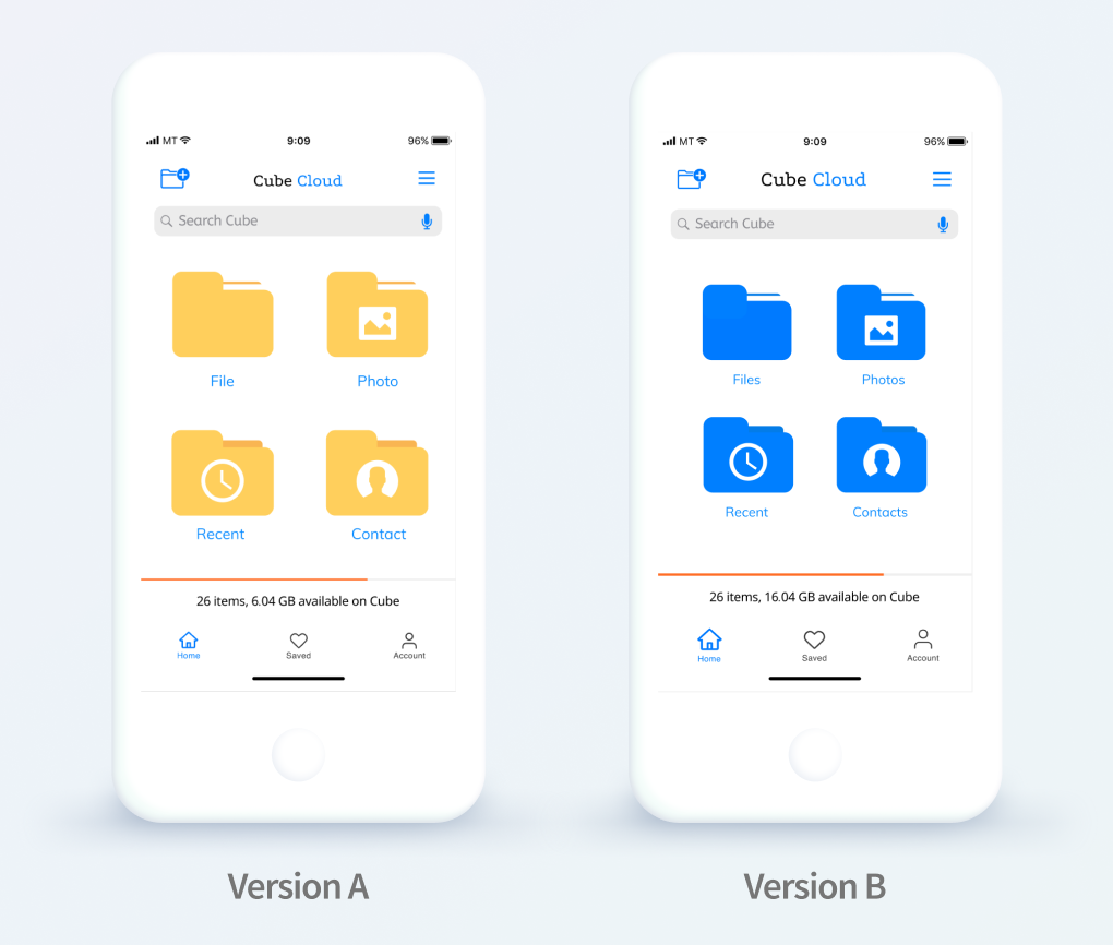
Case 1: 86% of the participants prefer the files in blue over yellow. Hypothesis: Matching the company color blue to the files will lead to an increase in the number of people to feel consistency. Result: 86% of the participants prefer the files in blue. Conclusion: I decided to use the blue file and make the folder a little bit smaller for the mobile version.
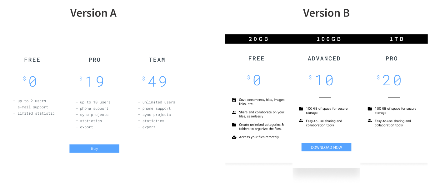
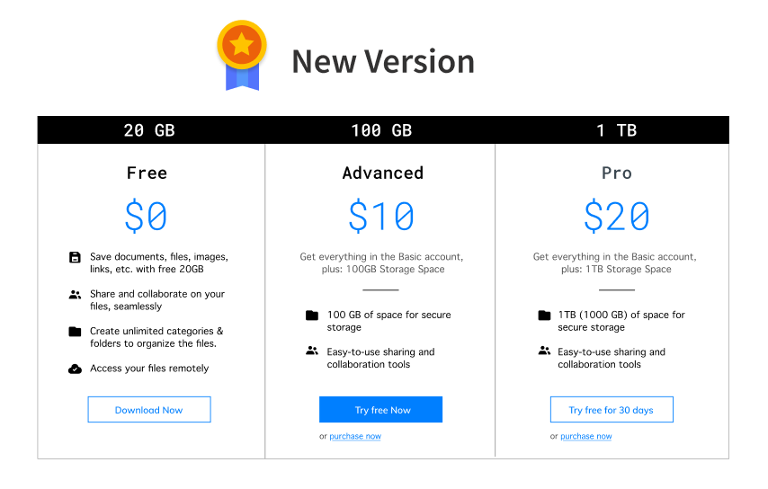
Case 2: 71% of the participants prefer version B. Hypothesis: Using a clear and bigger font size will lead to more downloads than the smaller font size. Result: 71% of the participants prefer version B, hierarchical placement, simple, cleaner look and better readability. Conclusion: I remake the price plan, combined both together, to make it a better version. See below the new version.

Prototypes
Seniors (ages 55 and older) are one of the fastest-growing demographics on the web. However, lots of usability studies show that many websites and apps are hard to use for seniors. For example, UI elements like dropdowns and sliders are more difficult for users with declining motor skills, particularly on touch interfaces. Older adults don’t need a ton of compensation to feel comfortable using an application. Following best practices and usability guidelines, in general, will go a long way toward making products accessible to all users, regardless of age or any physical or cognitive impairments.
VIEW PROTOTYPE
User Testing Results
Finding 1. Users had difficulty and didn’t have confidence using the search bar. Upon being prompted to find a specific item, users were immediately unsure of how best to begin a search. Users commonly first chose to use a more standard filtering method like the “Search by Recents” tool. They commented that “the search feels so small,” and typing is not the best way to search.
Recommendation 1. Incorporate voice comment on a search bar.
Finding 2. Most Users Do Not Scroll There are study shows that only 23% of visitors scroll on their first visit to a website or app. This means that 77% of visitors won’t scroll; they’ll just view the content above the fold (i.e. the area of the page that is visible on the screen without scrolling down). What’s more, the percentage of users who scroll decreases with subsequent visits, with only 16% scrolling on their second visit.
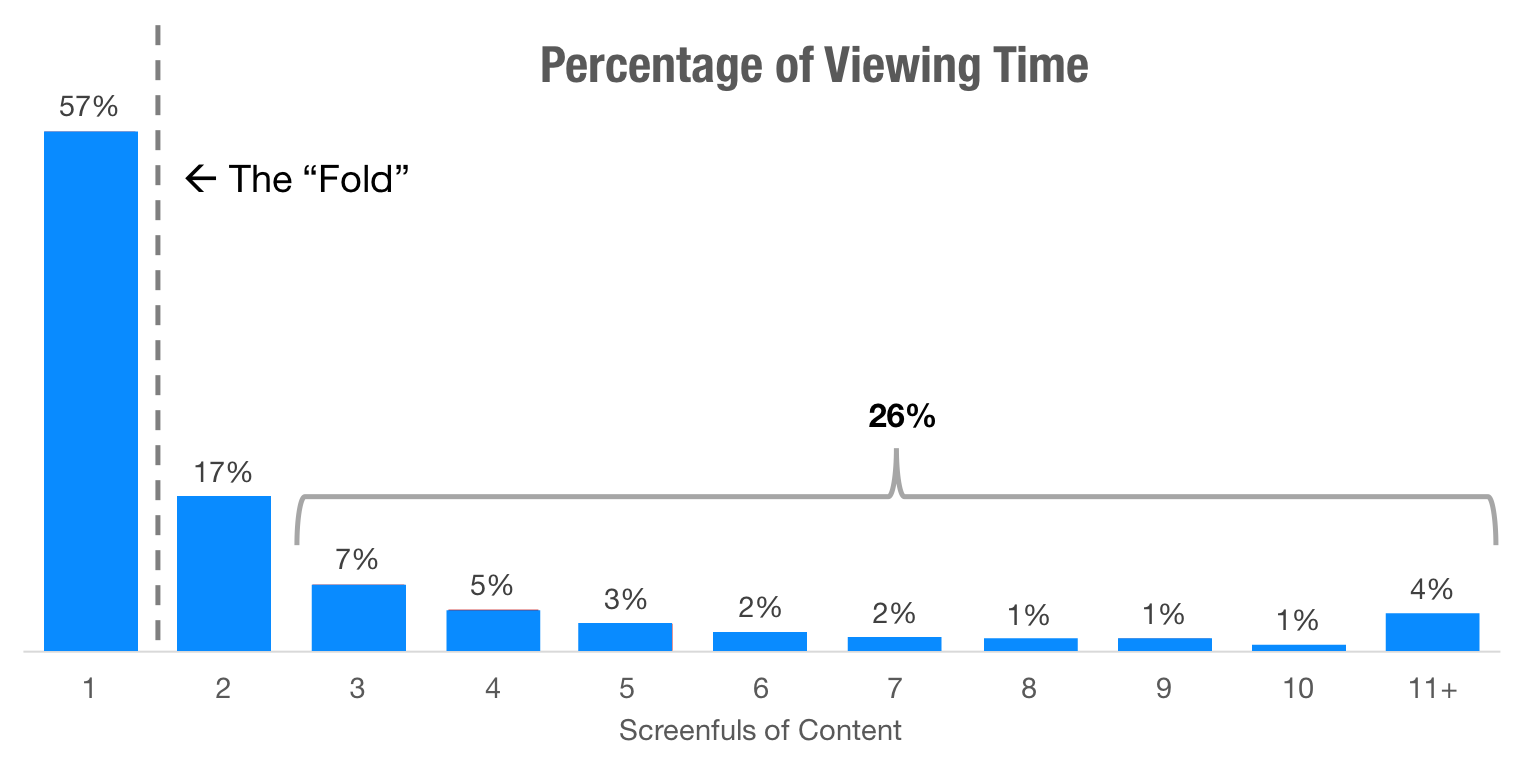
Recommendation 2. This data highlights just how important it is to place your key content on a prominent position, especially on landing pages.

The Final Product
CHAPTER # 5— THE GRAND FINALE
For this project, I think about the problems people encounter in
everyday life and how a simple app product could solve those problems.
Design a simple onboarding flow, as well as the in-app screens and
user dashboard. What worked in this project? User flows, page layout,
and visual design. User flows help determine how many screens are
needed, what order they should appear in, and what components need to
be present. This should lead to better user experiences as it places
the user at the heart of the design process. What didn’t? Navigation
considerations for the elderly, are our biggest challenge. First of
all, they don’t understand what “cloud storage” and what is for and
what does it do or help. What were my doubts about going into the
project? My target audience was seniors, but when I start working on
the project, I want all ages to use my app. But the target audience
can not be “everyone.” The more clearly I define my target group, the
better I can understand how and where to reach my best prospects. I
can’t target everyone, but I can sell to everyone. What surprised me
the most? I think the most basic definition of surprise and delight is
designing for moments. It’s about establishing an emotional connection
with your users and reminding them that the product they’re
interacting with is human. What would I have done differently if given
more time? None, I’m very confident in my design and app. What did I
learn while doing this project? 3 things I learned from doing my
project. To successfully design something that solves users’ problems
and meets their needs, UX professionals must be able to get out of
their own heads, interact with a cross-section of users, empathize
with them, and apply what they’ve shared to the product development
process.
⦁ Empathy: Put the users in front of everyone! Personas and
empathy maps are one way to deeply understand user needs.
⦁ Alignment: The research findings are very important. The
users and their pain points need to be considered when making any
decisions.
⦁ Iteration: Anything that is deve loped from scratch will be
an assumption. It’s essential to keep iterating to understand the
users and their needs while they evolve. If a test fails, test again.

Conclusion: Looking back and beyond
Creating this application challenged me to learn the importance of understanding user objectives. Instead of amplifying existing features and enhancing dashboard navigability within cloud storage, I had to restructure my approach to identify 1) the goals of my target audience, 2) the steps users were undergoing to meet those goals, 3) a solution that would optimize their current process. My problem objective of solely enhancing the discoverability of existing cloud storage products had immediately shifted when I found that users also wanted to improve their creative processes by exposing their work to a community of creative people. This realization was the key turning point that I wasn’t expecting. In addition to this, I also learned the importance of user testing as early and as often as possible. If I could give my former self one piece of advice, it would be to design less user flows early on in the design process so that I could spend that time focusing on testing just a few primary flows. You can design a solution as meticulously as possible, but there’s nothing quite like experiencing your users frustratingly fail at accomplishing tasks or insightfully delight at a key interaction to reiterate the importance and inevitability of testing. If I had more time, I would integrate three key features — notes, chat and advanced search capabilities to allow users to create more types of content quickly, engage even further with their community, and find information through visual and suggested search terms. Finally, designing this solution taught me so much about people, their expectations, and how small changes to even smaller interactions matter. I learned how to empathize and understand the impact that a product can have on a person’s mood when you focus on solving their problems. And in return, it’s amazing how helping my users gleaned a new, humbling perspective on my own goal — designing products that positively impact and serve the greater good. I came to the conclusion that if I can set out to help a person come up with an idea that has the potential to make a tiny fragment of our world a better place, then I have set out to help accomplish something magical and momentous indeed.
The final Cube Cloud prototype after both rounds of user testing and iterations can be viewed here.